2021 Colors of the year… Revealed!
When decorating interiors, you need to keep in mind modern fashion trends in the color palette selection. However, it should be noted that highlighting trend decoration shades is largely conditional but the main tendency in this area can still be implemented after reviewing various options. The general direction in figuring out the first preference shades and trendy colors 2021, is creating a quiet, light, peaceful, and natural surrounding in the room. The present-day interiors are marked by adjustable colors that are used in different compositions.
The major color trends in 2021
The smooth natural and earthbound colors prevalent last year are still here. Sandy ecru, smoke-gray, brown, and yellowish tones of different color saturation prevail in the interiors in 2021, colorist specialists admit. This palette harmonizes us with nature establishing the atmosphere of peace and harmony with the world outside in the room.
This color scheme will work well as the main backdrop and can be effortlessly followed up with other colors as well as adjacent shades of the same natural earthy palette. Gray, beige, and shades of white will appear in our homes this year. But the leading role will be played by one of the varieties of the natural color range: warm red-brown shades.
They will call to mind the burned-out soils of the South, handcrafted ceramics, and clay pots. Brown fills the house with warmth adding comfort to any interior and goes well with other natural tones, as well as natural wood. Warm and deep, it enhances the beauty of other shades and can serve as the basis for unusual and memorable color schemes.
This year, four big paint and coating manufacturers are betting on this color scheme:
- Benjamin Moore
- Sherwin-Williams Company
- PPG Paints
- Farrow & Ball

Aegean Teal color trend from Benjamin Moore
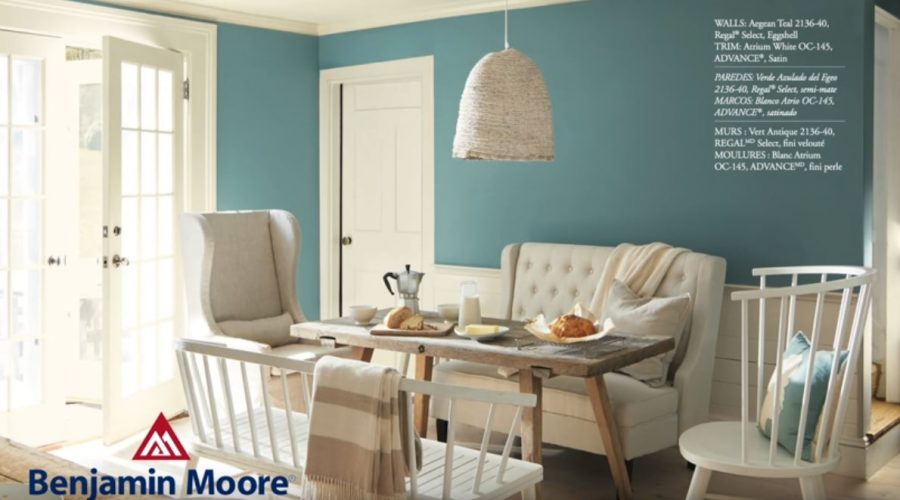
American paint company Benjamin Moore offers to fill the house with cheerful, natural colors in 2021. According to the design experts, Aegean Teal, a soothing mixture of blue and green with gray will take a key place in the interiors. This beautiful and rich color is a great alternative to blue. In fact, it is much calmer and more versatile than it might seem at first glance. It looks great on walls, cabinet fronts, kitchen furniture (a great example is here https://ultraassembly.com/blog/top-3-ikea-kitchen-ideas/), front doors, or bookshelves.
Kitchen cabinet color ideas & inspiration
Aegean Teal in 2021 can be used alone or in combination with other colors. Experts have developed a consistent palette of shades that perfectly combines with Aegean Teal. The color set is dominated by cheerful sunny shades, reminiscent of the warmth of the family hearth. Ripening fruits on the windowsill, warm and soft blankets, the sun’s rays looking through the window. These little elements of everyday life have inspired a unique palette that encourages peace and hope.
Sherwin-Williams Urbane Bronze palette
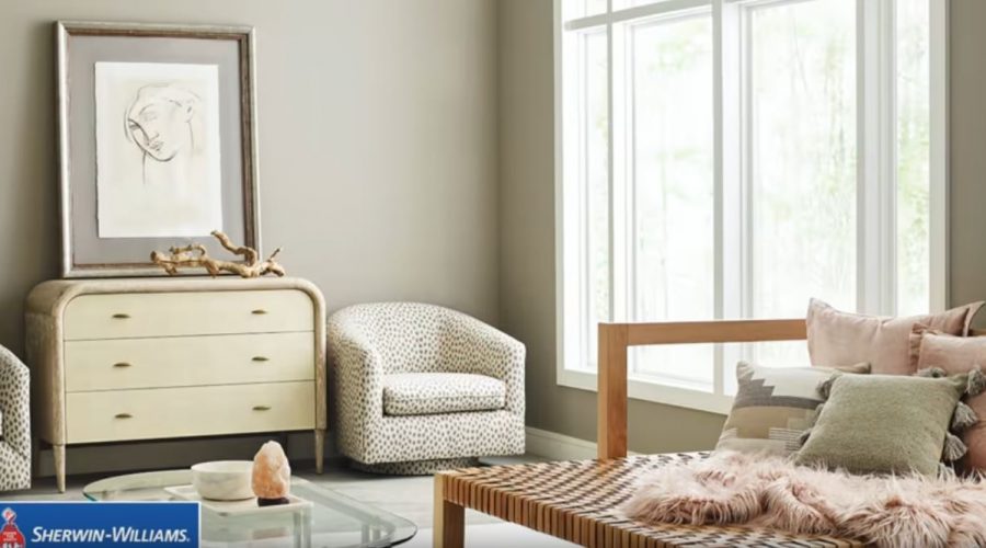
For 2021 the experts of the American manufacturer of painting and coating solutions chose a dark shade of brown with pronounced gray tones. This shade of bronze really looks calm and elegant. Like the pure Energy of Earth, it helps transform a home into a sacred place that promotes relaxation and recreation.
Urbane Bronze can be the leading color in the living room, bedroom, or kitchen. This color looks very advantageous when surrounded by light tones like beige, cream, contrasting white, as well as shades of green. An interior where bronze is dominated will also be a beautiful backdrop for wood furniture, stone cladding, woolen fabrics, and sparkly silver or gold accessories.

PPG Paints color solutions
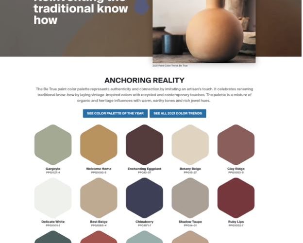
PPG, one of the world’s leading paint manufacturers, has surprised the interior design industry by offering for 3 trendy shades in 2021. This time, the brand has moved away from dark strong colors for the benefit of cheerful and soothing shades of the Be Well palette:
- sandy beige (Transcend)
- cinnamon with a hint of orange (Big Cypress)
- blue-mint (Misty Aqua)
All three colors are in perfect harmony with each other, creating a solid and complete basis for the interior composition. The colors of the Be Well palette bring the feeling of peace and comfort simultaneously.

Trend color directions from Farrow & Ball
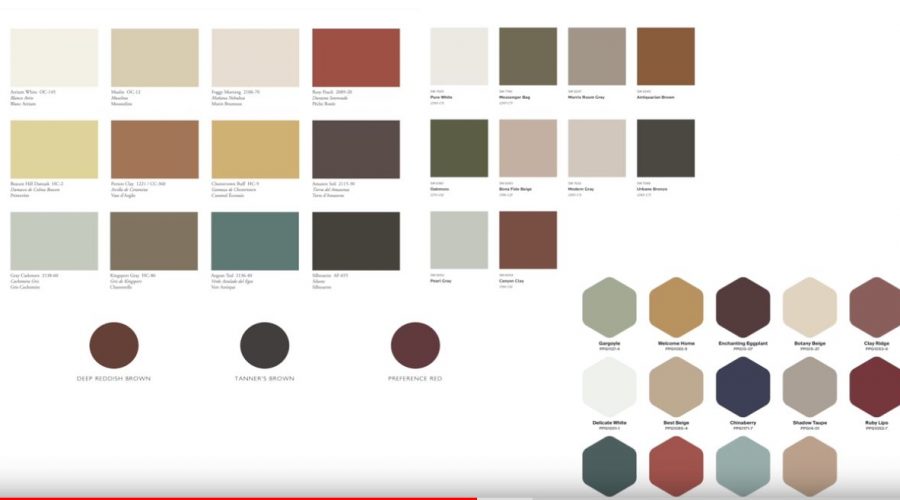
In 2021, the company withdrew dark charcoal and blue shades in favor of softer natural tones. They look stylish during the day and cozy in the evening, creating a calm yet luxurious atmosphere, especially when combined with other tones taken from nature. These colors can be added to a neutral bedroom palette as they promote relaxation and comfort.
Shades of blue have a calming effect despite their cool tonality. In rooms where there is little light, as well as in the evenings, these colors will look more luxurious and elegant. A green palette, with olive notes, is ideal for those who want a richer palette of the mid-century modern style but want to stay in touch with nature.

The principle of the interior shades selection
The dominant design principle is grounded on the next proportions:
- 60% base tone
- 30% additional shade
- 10% accent color
The search for interior color solutions has an objective to solve not only the issue of the outreach fashion tendency. Each person needs to express their priorities and create an atmosphere of comfort and relaxation according to the norms of aesthetics and harmony. Analyzing style and color directions, it can be said that the options set out below are popular in 2021:
- The varieties of the mixed color scheme involve calm pure blue shades. When correctly distributed over the surfaces, the cornflower blue, light azure, deep cold sky, turquoise color create an atmosphere of originality, tranquillity, security, and relaxation in the surrounding space.
- Use a wide-ranged pastel palette from a clarified sand color scheme to a pronounced cream shade or room decoration. For example, any shade of versatile sand color (golden sand, dry straw, pure beige, etc.) easily gets along with any, even very strong colors. The stylish look of the sand palette looks noble, calm, and cozy.
- A combination of graphite, light gray, and white tones with bright colors accents. This choice is advantageous in any situation. The calm atmosphere provided by the basic background makes it possible to relieve emotional and nervous tension.
- Invigorating notes of natural greenery. Both fragile and tender green, sensitive mint, malachite variations, and shadowy turquoise, olive shades remain relevant. Mint, pistachio, green reed can solo in the room. Light green is acceptable for people requiring renewal. Conservative individuals opt for a deep and harmonious dark green color scheme.
- A creamy tone, liked by people who appreciate classics, comfort, and balance, may prevail but will demand darker neighboring accents, such as bronze or chestnut.
Also, the trend, which assumes principles of biophilia (bringing nature inside) does not lose its leading positions. Natural color solutions have a unique personality and invariably attract attention.
